I used labels on our invitations. CLEAR mailing labels. And, *gasp* colored ink! I wanted something that looked nice and neat but couldn't afford calligraphy (or rather, calligraphy wasn't something I cared enough about to splurge on) and I don't like my own handwriting enough AND kind of was just too lazy to address them by hand.
So here ya go. The finished envelopes.
-Labels, my mom
-Envelopes, Silver Pearlescent Metallic from PaperandMore
Front:
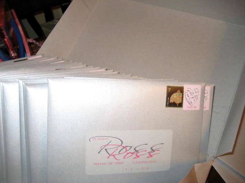 -Stamp, Etsy
Back:

These--the DIY pocketfolds fiance and I worked long and hard to assemble-- are getting sent out tomorrow!! I feel like we are sending off our children! I am pleased with how they came out EXCEPT for the hideous freaking one-cent "tiffany lamp" stamp. I mean come.on. US Post Office. Can we do a little better with the aesthetic appeal of the one-centers--assuming that most people will be buying them for a WHILE?!
Will post detailed photos of the actual invite tomorrow.
FYI--Here were our DIY Save the Dates (in case you missed) And yes, I addresses all 150 of these myself with my trusty Sharpie:
Front:
-Envelopes, Azela Metallic, PaperandMore
Back: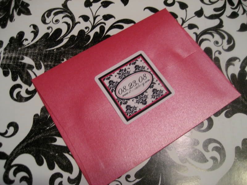
Actual Save the Date (Vista Print):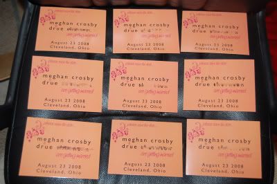
The orange (tangerine) color started as a piece of our color scheme so it is reflected throughout our correspondence stationery. But we have since ditched it. Hey. A girl can change her mind!
Happy Friday!


